Role
UX Designer
Time
Feb 2024 - May 2024 (3 months)
Tools
Figma / Trello
Solution
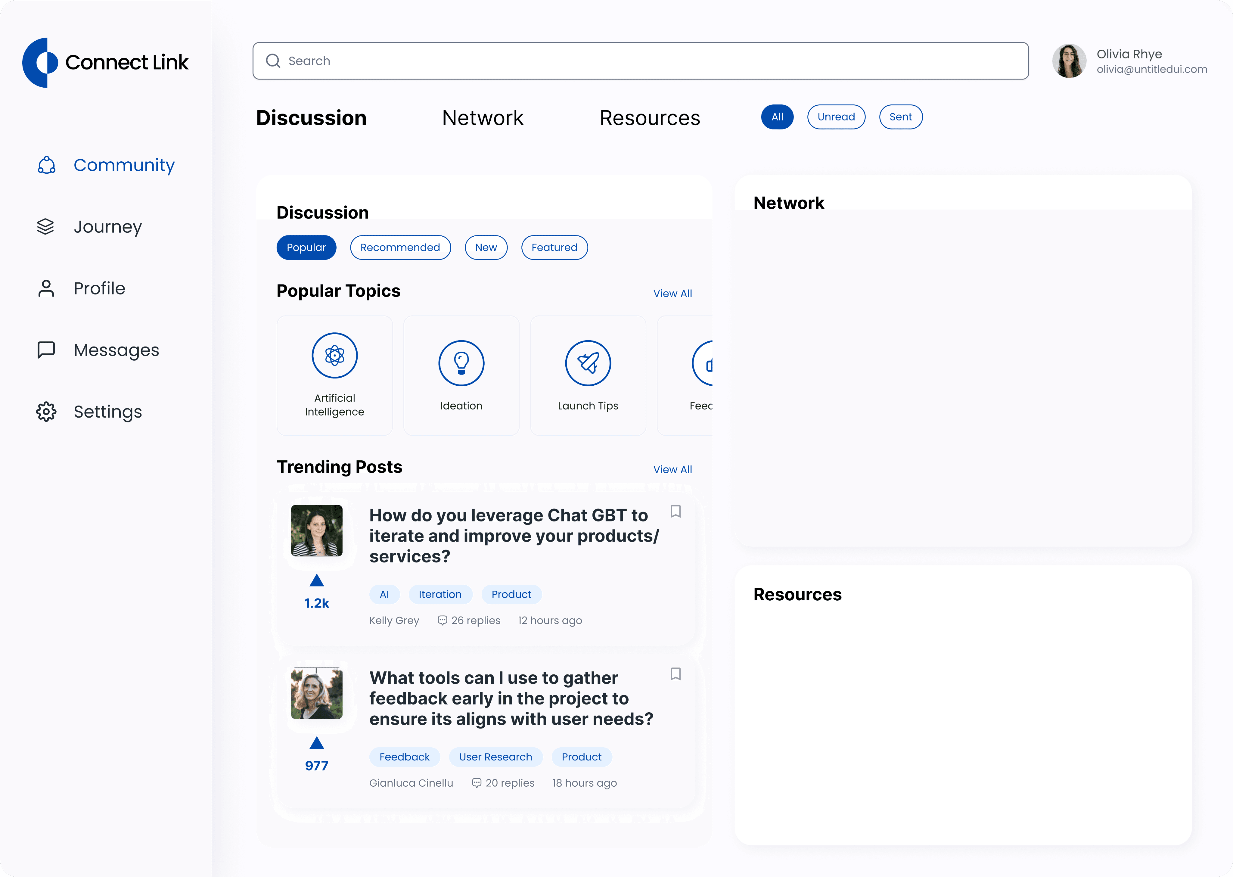
Creating a design system to accelerate the design process and provide a cohesive user experience
Approach
We started with creating a style guide for the system, which includes the grid system, fundamental elements like the colors, font size, and typography to speak for the company brand. After that, what we needed to do was implement any new changes or elements to the system and link the existing style guide.
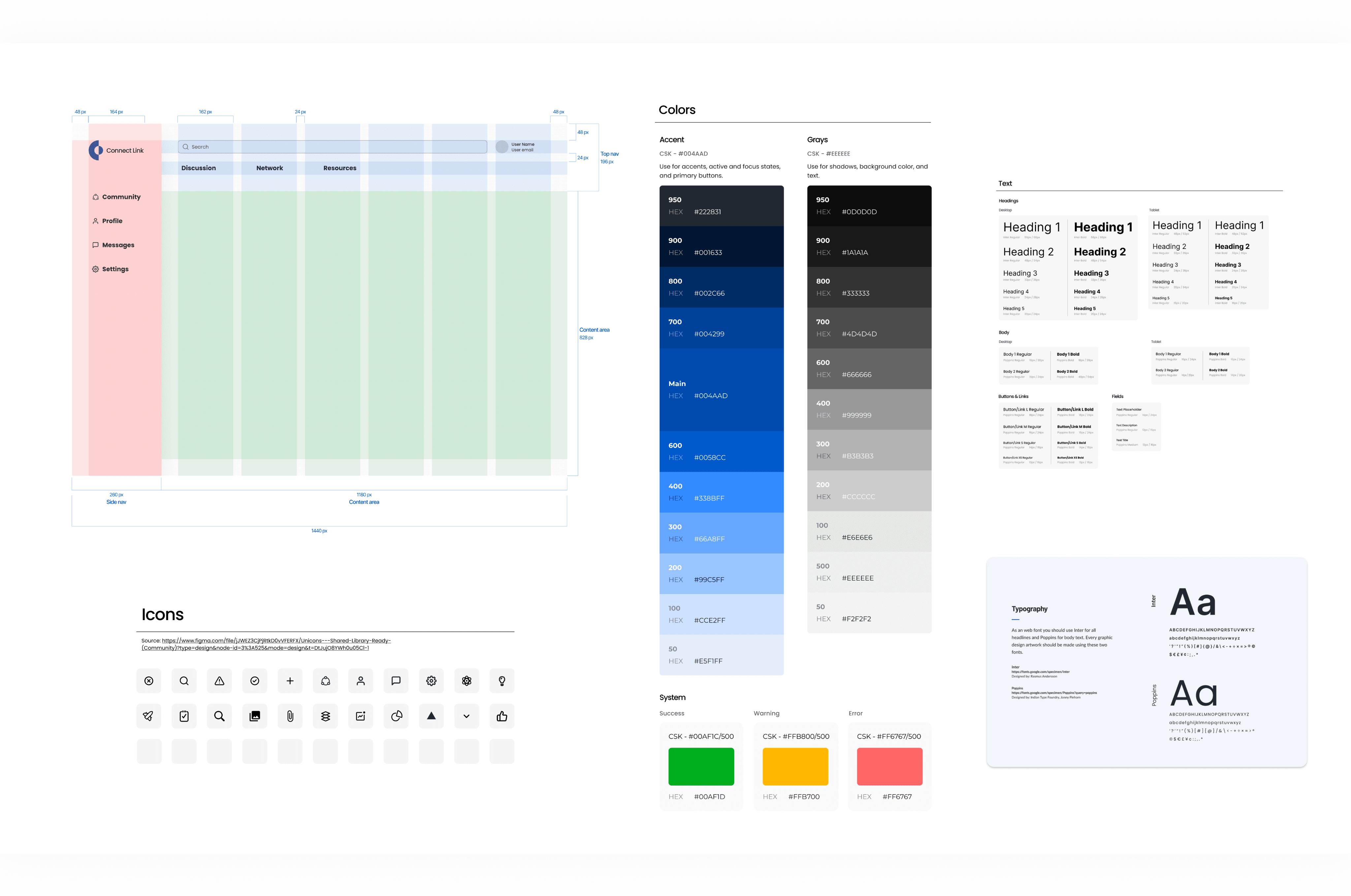
The style guide consists of:
Layout grids
Spacing guidelines
Branding: colors, typography (Desktop & Tablet & Mobile), logos
Icon pack
Shadow
Border Radius Guidelines
These style guides are incorporated into the component library as well, to provide relevant guidance in context.
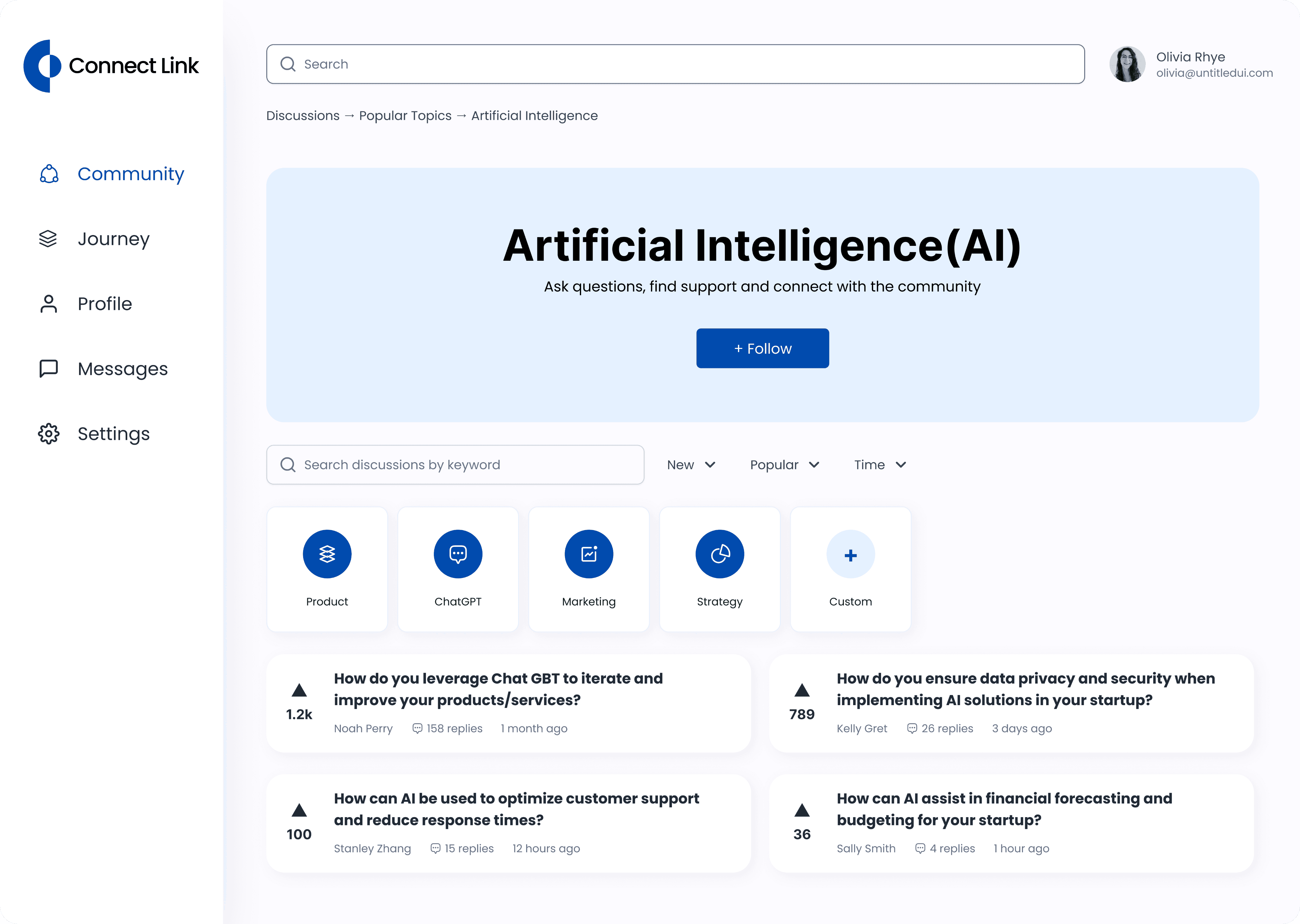
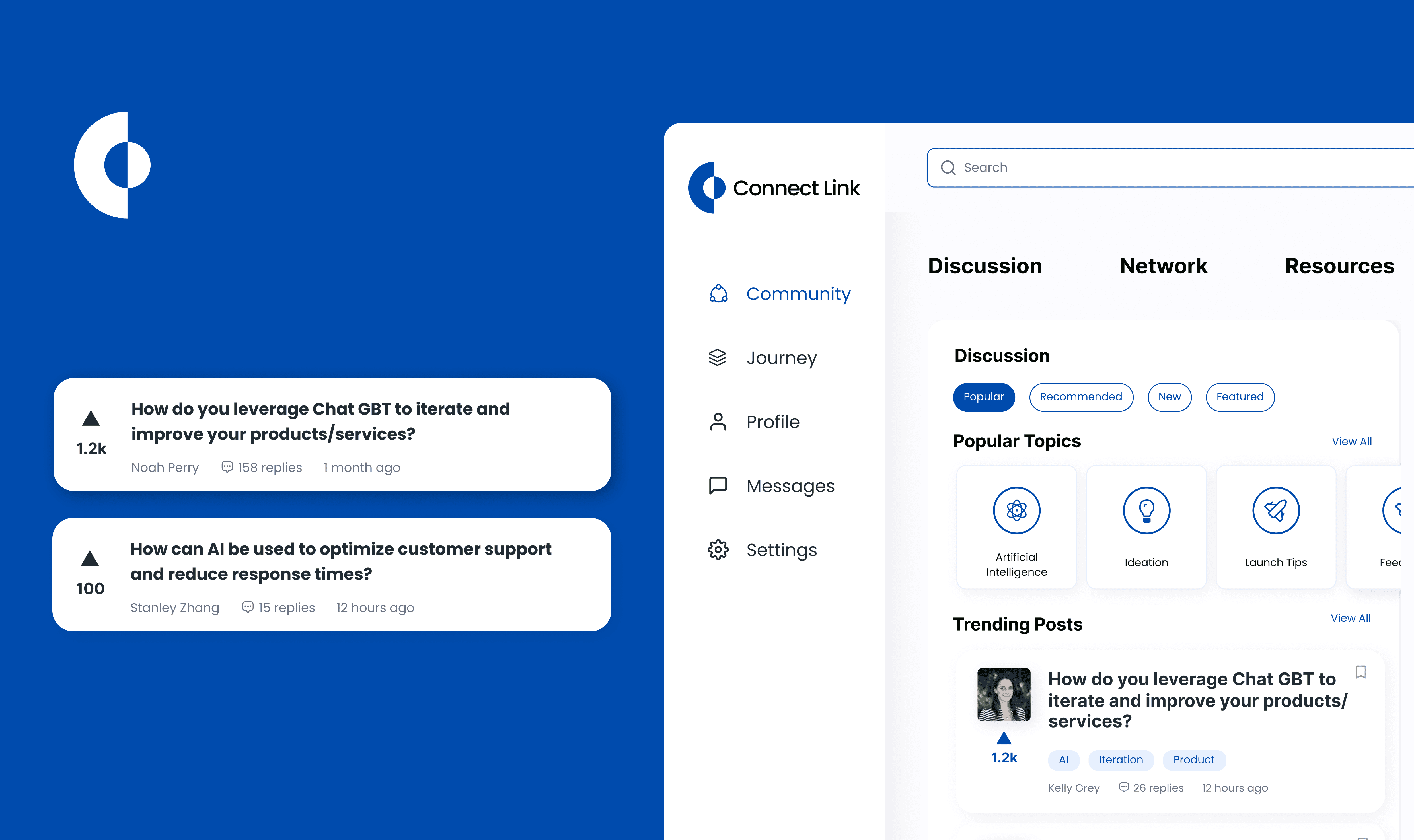
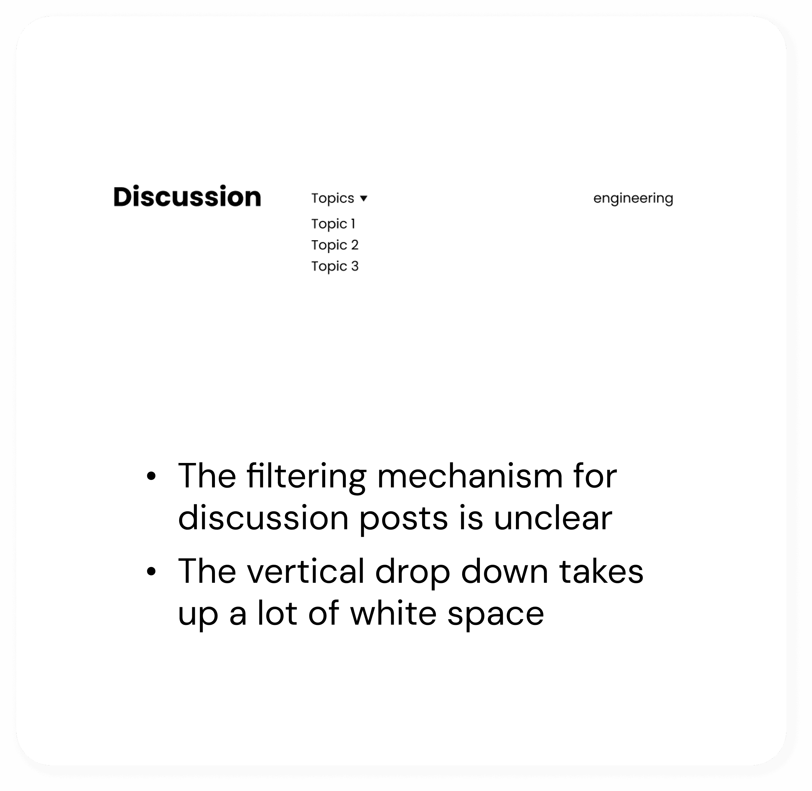
Challenge #2: Streamline the clicks, eliminate the confusion
The user flow for the wireframes was not clear enough, leading to repeated clicks and user confusion. This indicated a need for a more defined user flow and clearer design to make the user experience smoother and more intuitive.
Solution
Taking the mid-fidelity wireframes a step up - ensuring that users can navigate the system efficiently
Approach
We started with going through the user flows, and identify steps in the mid-fidelity prototypes that are confusing to navigate through. We listed all the possible confusions and tackled them one by one.
Before
After
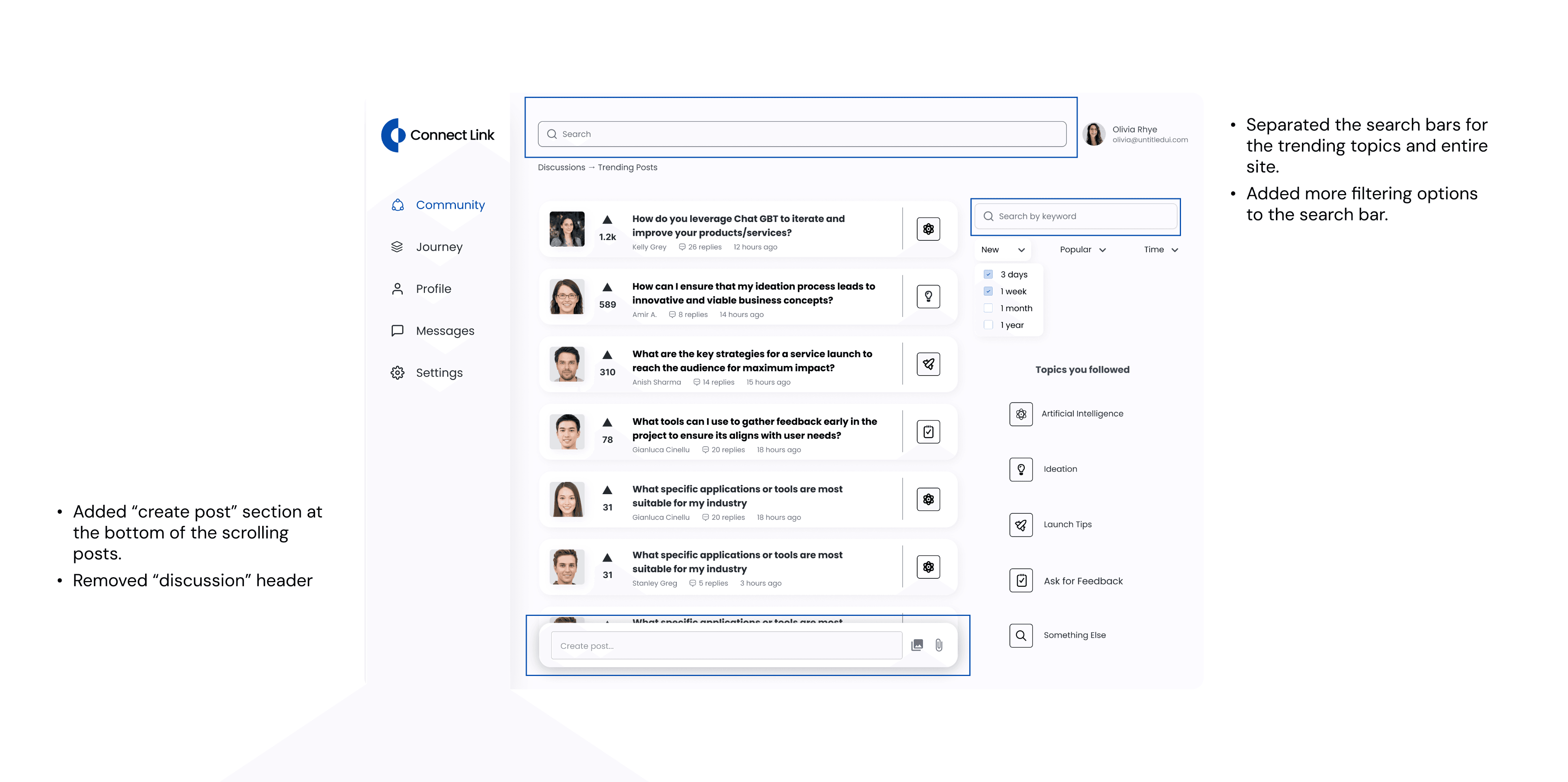
Before
After
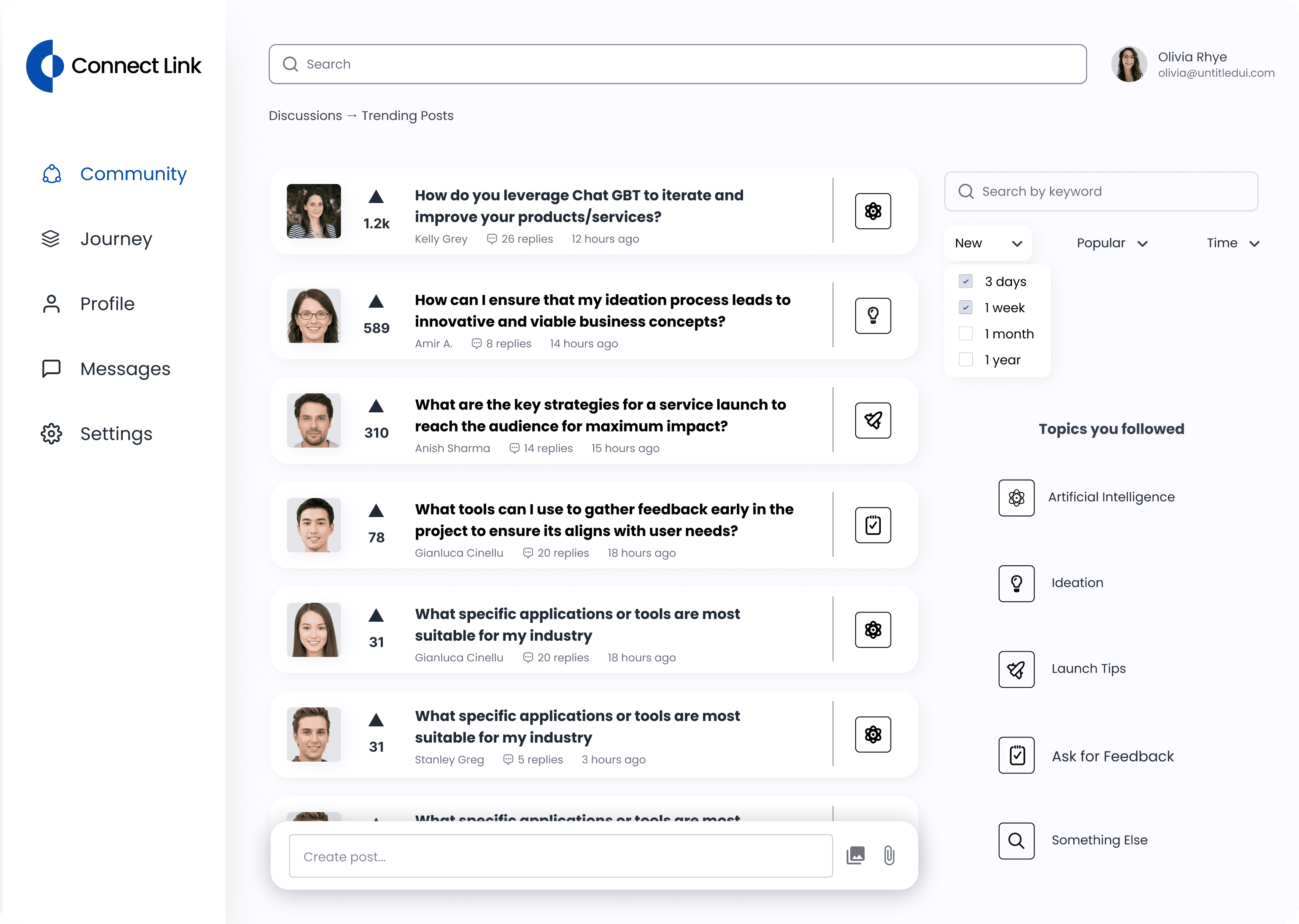
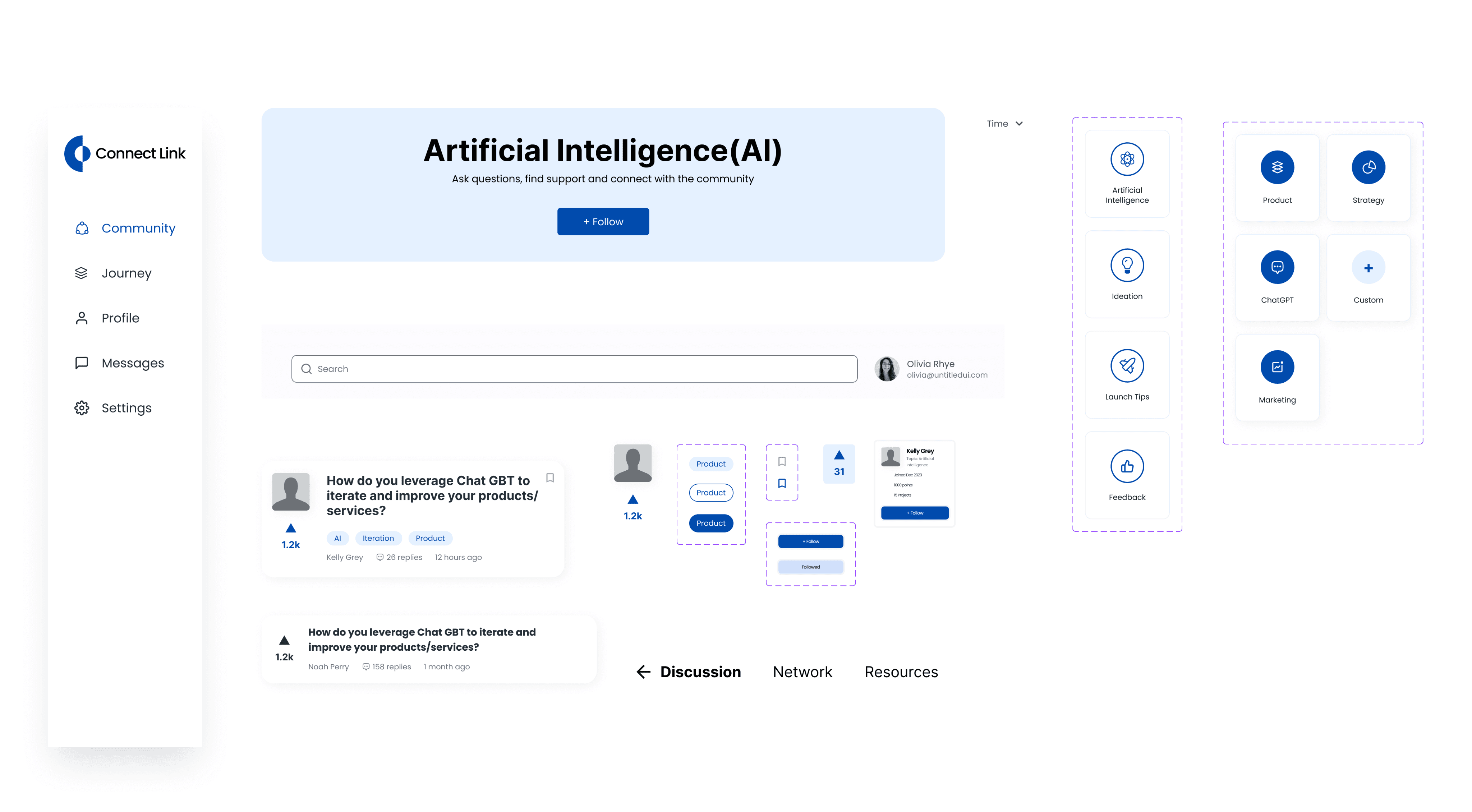
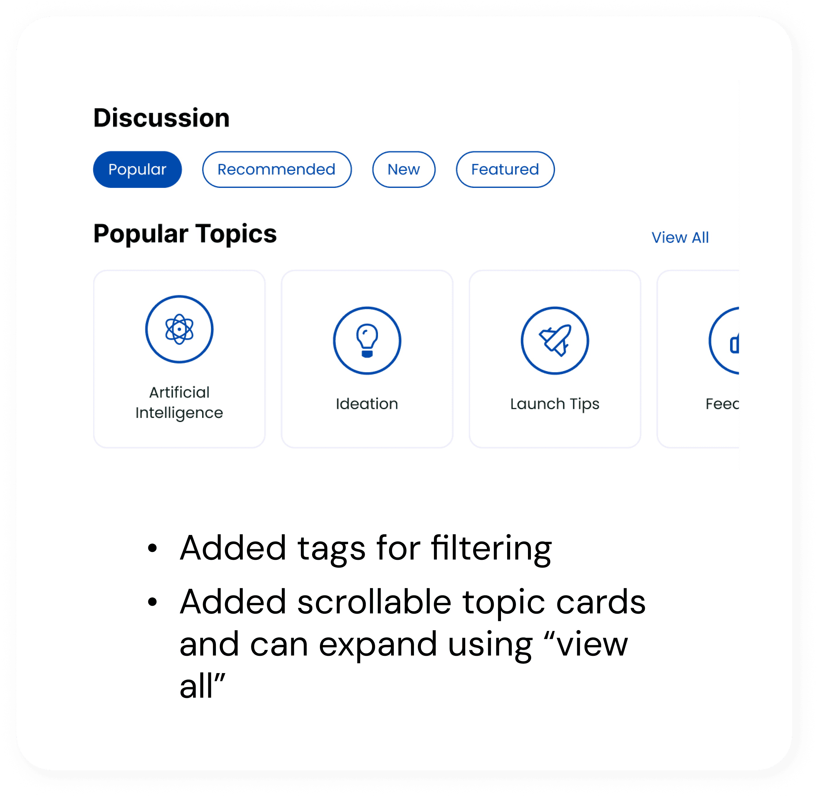
Challenge #3: The attention to details
In the process of designing and including numerous components for the dashboard, there was a lack of feedback from both other designers and users to determine which design goes along with other components and should be included in the final design.
Solution
Conduct A/B testing to refine design detailed for a smoother user experience
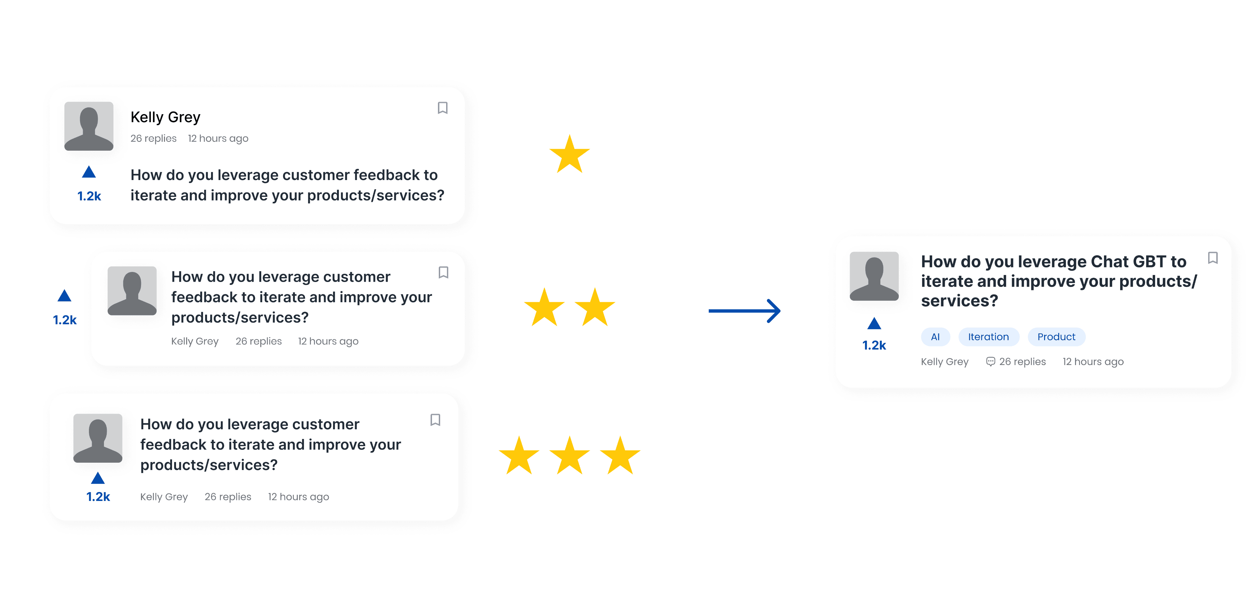
Design Decision #1: What information should we include in a post overview
Adding labels/tags for more specified information
Satisfy customer’s need for filtering information more efficiently, clearer visual hierarchy
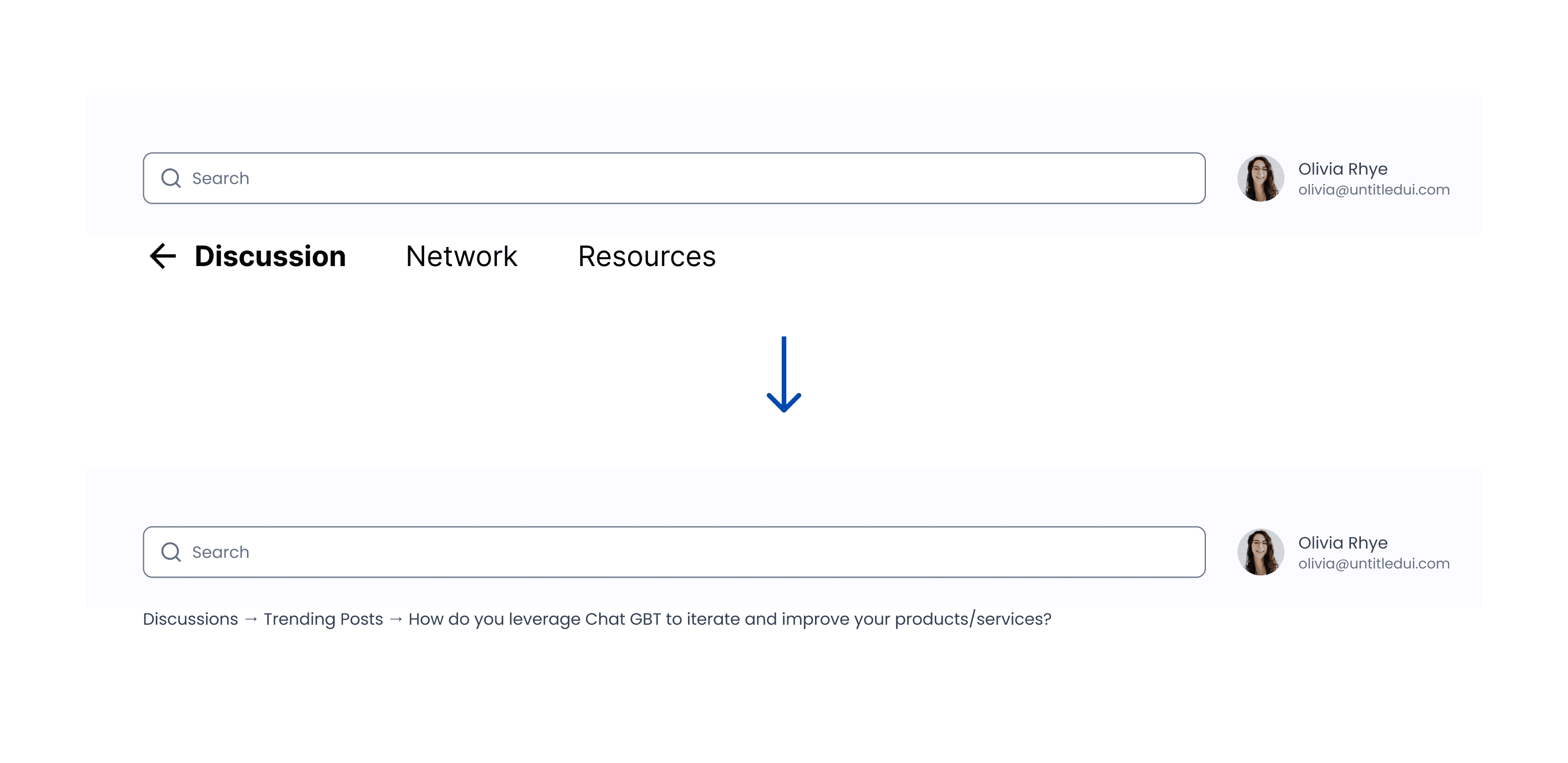
Design Decision #2: Top navigation bar vs. Breadcrumbs?
The top navigation bar was general and didn’t contain useful information. Replacing it with a more directing and detailed breadcrumb can help better navigate the users through information structure.
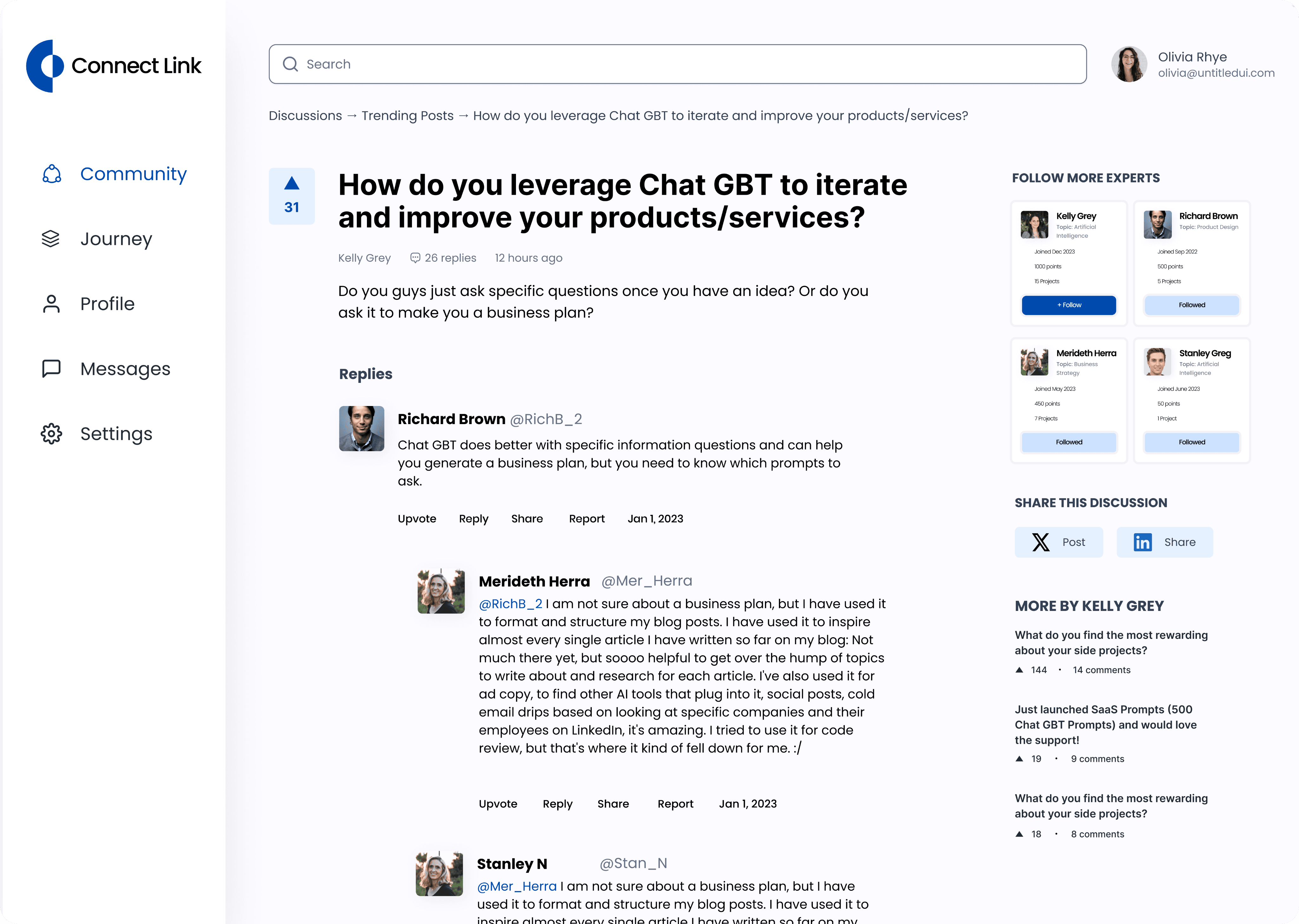
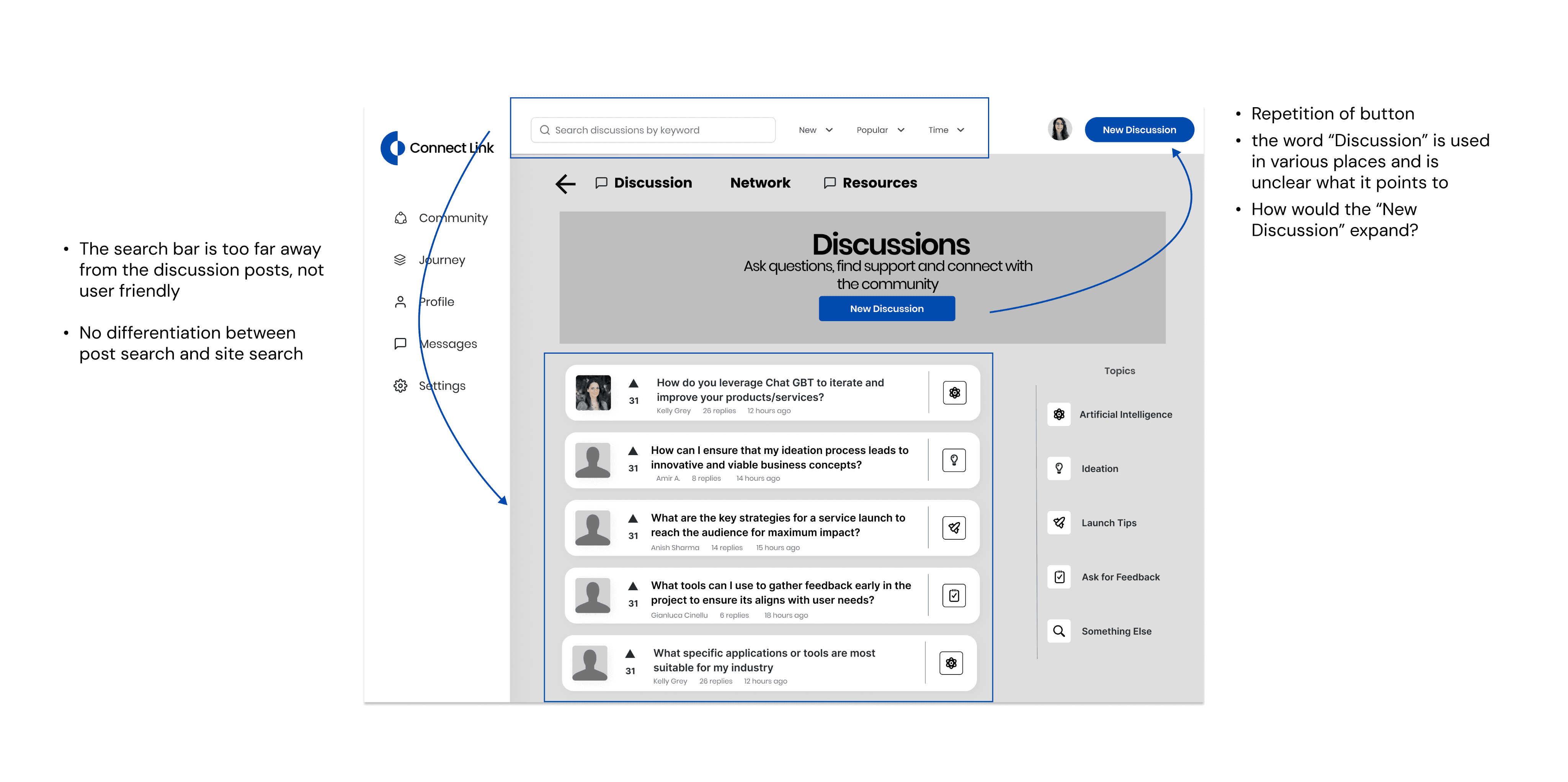
Final Solution